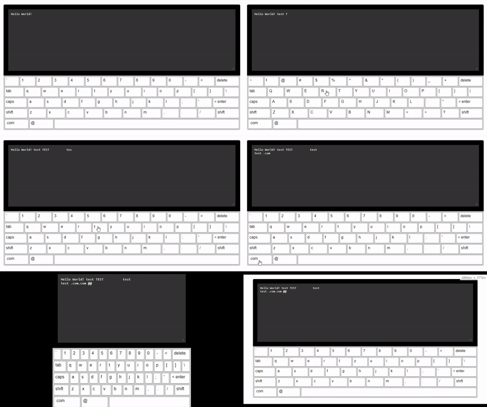
simple-keyboard
An easily customisable and responsive on-screen virtual keyboard for React.js projects.

Installation
npm install simple-keyboard --save
Usage
import React, {Component} from 'react';
import Keyboard from 'simple-keyboard';
import 'simple-keyboard/build/css/index.css';

class App extends Component {

  onChange = (input) => {
    console.log("Input changed", input);
  }

  onKeyPress = (button) => {
    console.log("Button pressed", button);
  }

  render(){
    return (
      <Keyboard
        onChange={input =>
          this.onChange(input)}
        onKeyPress={button =>
          this.onKeyPress(button)}
      />
    );
  }
}

export default App;
Need a more extensive example? Click here.
Options
You can customize the Keyboard by passing options (props) to it. Here are the available options (the code examples are the defaults):
layout
Modify the keyboard layout
layout={{
  'default': [
    '` 1 2 3 4 5 6 7 8 9 0 - = {bksp}',
    '{tab} q w e r t y u i o p [ ] \\',
    '{lock} a s d f g h j k l ; \' {enter}',
    '{shift} z x c v b n m , . / {shift}',
    '.com @ {space}'
  ],
  'shift': [
    '~ ! @ # $ % ^ & * ( ) _ + {bksp}',
    '{tab} Q W E R T Y U I O P { } |',
    '{lock} A S D F G H J K L : " {enter}',
    '{shift} Z X C V B N M < > ? {shift}',
    '.com @ {space}'
  ]
}}
layoutName
Specifies which layout should be used.
layoutName={"default"}
display
Replaces variable buttons (such as
{bksp}) with a human-friendly name (e.g.: "delete").
display={{
  '{bksp}': 'delete',
  '{enter}': '< enter',
  '{shift}': 'shift',
  '{s}': 'shift',
  '{tab}': 'tab',
  '{lock}': 'caps',
  '{accept}': 'Submit',
  '{space}': ' ',
  '{//}': ' '
}}
theme
A prop to add your own css classes. You can add multiple classes separated by a space.
theme={"hg-theme-default"}
debug
Runs a console.log every time a key is pressed. Displays the buttons pressed and the current input.
debug={false}
newLineOnEnter
Specifies whether clicking the "ENTER" button will input a newline (
\n) or not.
newLineOnEnter={true}
Methods
simple-keybord has a few methods you can use to further control it's behavior.
To access these functions, you need a ref of the simple-keyboard component, like so:
<Keyboard
  ref={r => this.keyboard = r}
  [...]
/>

// Then, on componentDidMount ..
this.keyboard.methodName(params);
clearInput
Clear the keyboard's input.
this.keyboard.clearInput();
getInput
Get the keyboard's input (You can also get it from the onChange prop).
let input = this.keyboard.getInput();
setInput
Set the keyboard's input. Useful if you want the keybord to initialize with a default value, for example.
this.keyboard.setInput("Hello World!");
It returns a promise, so if you want to run something after it's applied, call it as so:
let inputSetPromise = this.keyboard.setInput("Hello World!");

inputSetPromise.then((result) => {
  console.log("Input set");
});
Demo

To run demo on your own computer:
- Clone this repository
npm installnpm start- Visit http://localhost:3000/
Note
This is a work in progress. Feel free to submit any issues you have at: https://github.com/hodgef/simple-keyboard/issues


